|
I have been on far too long a hiatus and I don't really have any good excuses. Being given an updated order of studies really kicked my butt back into gear because of the sheer volume of content I need to complete. To go with new resolutions, I will also attempt more non-assessed activities.
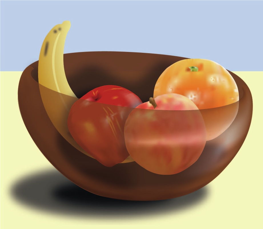
Things to consider: - prioritise non-assessed activities carefully - consider moving course journal to blogspot - develop more connections on the forums - compile a list of friends/acquaintances/facebook people whom I can regularly/reliably ask for feedback and constructive criticism I have 15 months. Let the panic begin. The focus for this activity was typography that communicated emotion. I decided to narrow down the topic to a particular medium, namely books, because I have a bunch of them. Books generally give me emotional reactions, even if I haven't read them yet, because beautiful design communicates to much to me. I narrowed my focus down further to look at Victorian and Modernist fiction/spec fic/fantasy/horror, because apparently I have a few. The covers for 'Frankenstein' and 'Dracula' are similar, they are drawing on a combination of class, elegance, gothic tones, and metal type lettering. The Dracula font is sharper and leans more towards gothic, whilst the Frankenstein font has more body, a softer look, akin to Victorian carnival or 'nomadic' subcultures. The black and red are a fairly obvious choice, there are fewer colour pairings as strong as good old black and red. The cover for the collected works of Poe is a simpler slab serif font, similar to early 1900s modernist typography, but with an affected kerning and letter size, to connect better with the themes of madness and lack of control commonly found in Poe's writing. Speaking of madness, the extremely sharp sans serif font of the Lovecraft collection seems to be used in extreme juxtaposition to the content held within. The very busy, energetic cover needed something to keep the cover 'under control', and extreme and sharp angles are a common motif in Lovecraft's work, so the font on the front manages to make me still very uncomfortable. It's neatness and even kerning and uniform strokes feel like a false sense of security, 'too good to be true', that you still end up opening the book with a sense of dread. There is a mix of different feelings with the Dorian Gray cover. The narrow lettering is reminiscent of the late Victorian, proto-art deco era in which Wilde wrote. The decadence held within is probably what pushed the designer to draw on art deco stylings despite the book being written significantly before that era. The decadence and engorged bowls and round counters of this typeface imitate the lavish lifestyle of the titular character, as well as hinting at the gluttony that is ultimately his downfall. 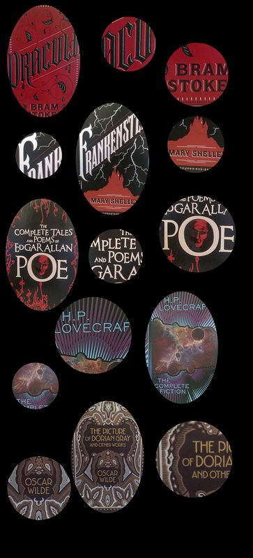 I was very determined after my frustrating experience with learning Illustrator whilst trying to complete the first assessment, so I decided I would give gradient meshes another go. I ended up using a few different 'processes', to create the fruit in order to learn what was better.
 After reading through the linked article about design process and avoiding or carefully utilising cliché, I collected some images related to drinking, driving and teens doing these things on a Pinterest board. The main motifs I observed were:
I sketched ideas to see what visually came about. My initial idea was to use a bottle or glass to obscure the road or important information to communicate the impact alcohol has on perception and safety. 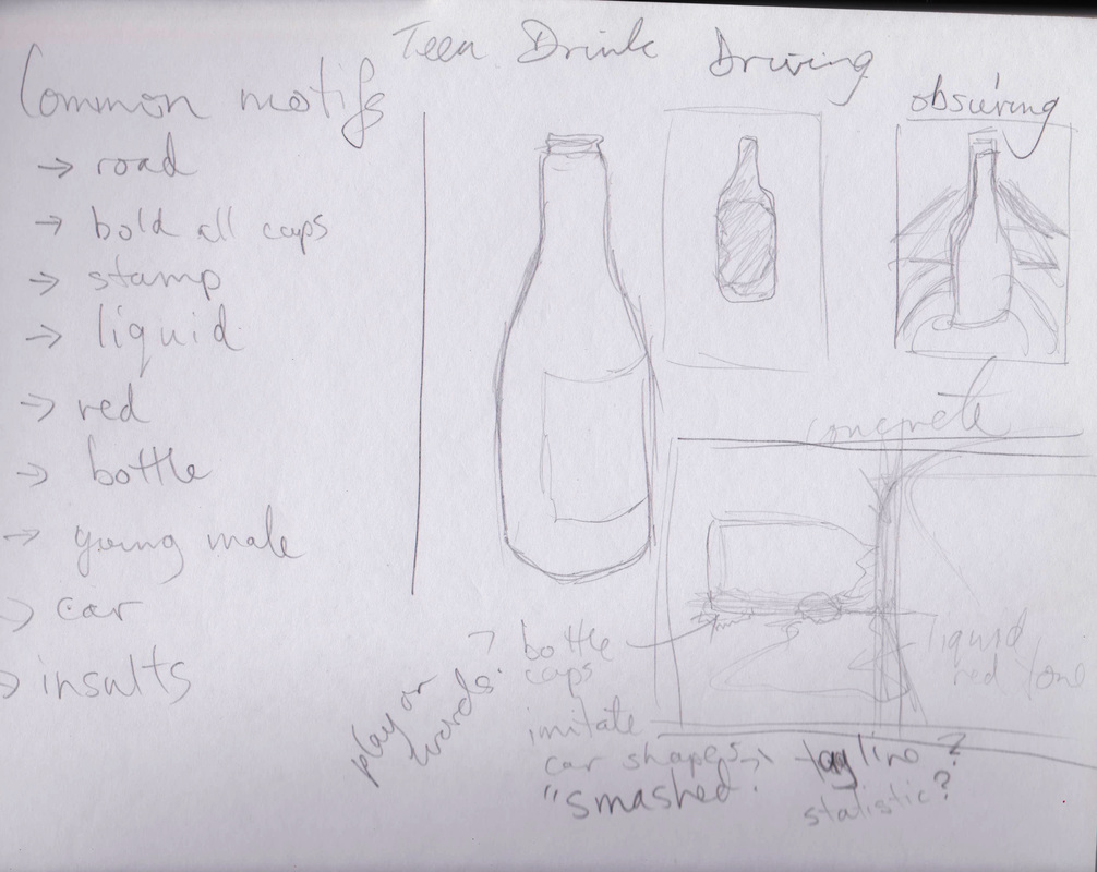 I apparently also forgot how to spell ‘obscuring’. I realised that I was lacking enough inspiration, as a lot of existing designs on close to this topic were related to either drink driving, teen drivers, but not often both. I re-read some of the articles from the online resources and realised I needed to further embrace research, especially as a statistic or quote could be an effective tagline. Research lead me to a range of sources, which in turn revealed several discourses through which the topic of teen drink driving could be viewed: insurance, health, statistics. Different emphasis was found from source to source: youth health, use of drugs by young people, safety or ability of young drivers, alcohol itself, risky behaviour in general which included drink driving. In general, the focus was on the impact of the driver, whether it be their reputation, costs, or their life. While some data referred to the damage it can have on others, it seemed that a more ‘self-centred’ approach made sense, which is in line with existing campaigns/designs that entreat the viewer to take care of themselves or insult them for drink driving. http://www.cdc.gov/vitalsigns/teendrinkinganddriving/ The CDC don’t muck around, so their information seems useful. A visual link between drink driving and disease is perhaps too complicated and risks the message being obscured by contextual information (comparisons to other causes of death, numbers not seeming significant enough, not enough link to the ‘driving’ element of the problem). http://www.progressiveonline.com.au/teen-driving.aspx Despite not being a ‘health’ related site, the insurance site had useful and significant information. This same information was found on other sites, so they weren’t the only ones to use the same health source, but their choice of what information to use and the fact that they had it at all impressed me nonetheless. I came away with the idea that driving is dangerous enough for teenagers, let alone when you bring alcohol into the situation. References to existing ‘costs’ or ‘risks’ could work as a warm up to an ultimate ‘cost’ of death, which could work in a campaign, but not necessarily on a single design. http://www.abs.gov.au/AUSSTATS/[email protected]/Lookup/4102.0Chapter5002008 As expected, the Australian Bureau of Statistics was flush with information, not all of it ‘exciting’, but definitely related to the specific issue of teenage drink driving. It also referred to vehicular collisions as the leading cause of death for young people, though it didn’t specify what portion was attributed to drink driving. https://www.betterhealth.vic.gov.au/health/healthyliving/alcohol-teenagers The Better Health site from the Victorian government used the sentence ‘Alcohol or ‘booze’ is widely used by young people’, but it was still useful in that it contained a link between deaths and BAC. Ultimately, I decided my mood board needed to utilise colour, keywords and a small range of symbols or visuals. 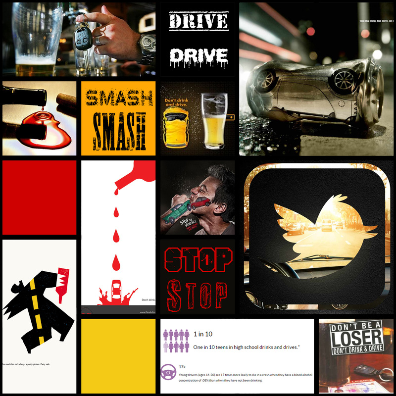 I decided to let myself play with colour and thought process within the scenario, adding a 'story' to the brainstorming (I feel like good advertising and visuals in general tell some sort of story).  So after several months lost to illness, I finally finished and submitted the first assignment. I wouldn't let myself do any other activities as I knew they would serve as a distraction to the more important assessment. Final design ended up looking like:  So that's neat. Now I'll be back on learning activities in order to get back into the swing of things.
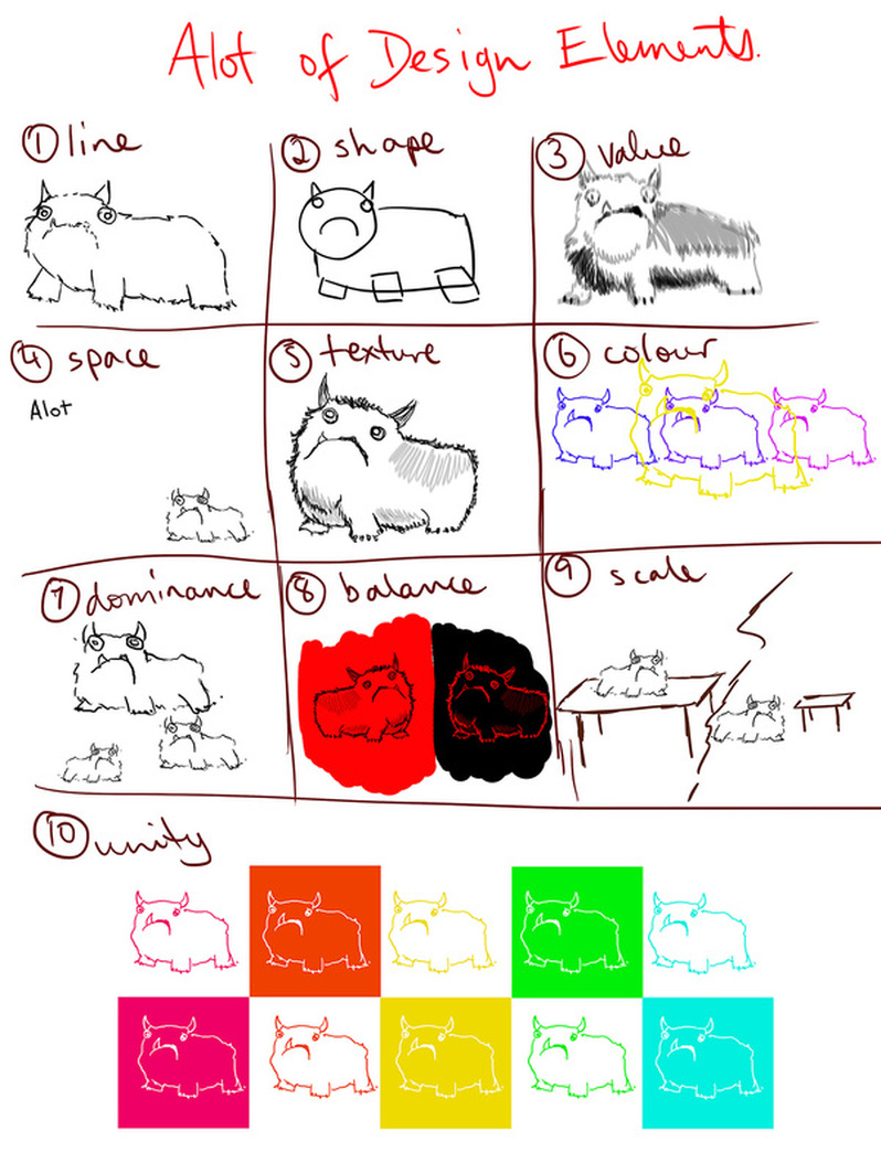
Also Illustrator is going to be really frustrating right up until the moment that it isn't. We were asked to look through this slideshow of quotes regarding creativity and design. I've chosen the ones that spoke to me in one way or another. I consider them to all fit into 1 of 2 categories: Ideals I hold to be 'true', and Ideals I Aspire to adopt. Ideals I hold to be 'true'I put the word 'true' in inverted commas because I understand that nothing is necessarily fact when it comes to creativity, and whilst I struggle with post-structuralism as a philosophy for life, it makes a lot of sense 'on paper' and in creative fields. Ideals I Aspire to AdoptWhen I say 'aspire', I mean that I either haven't considered them before, or I believe the sentiments but know that I still struggle to incorporate these ideals into my own practice, especially when it comes to 'change' and 'learning'. 10 elements - Alot of each
 http://stjohn.org.au/ 130 years experience in training Red/dark pink Part of overarching Order of St John which operates in over 40 countries "The Order of St John traces its origins back 900 years to the Knights Hospitaller from whom St John today derives its inspiration and maxims – Pro Fide Pro Utilitate Hominum, 'For the Faith and in the Service of Humanity.'" "The movement spread to Australia in 1883 " Knights saving pilgrims and crusaders, revived in 19th century 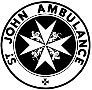 Ideas: - emergency call 000, references to Carol King's 'You've got a Friend' - "All you've got to do is call, and I'll be there." https://www.youtube.com/watch?v=Q7RPCFfudmU - 'Ain't no Mountain High Enough', silhouette/outline of ambulance driving over the hill towards viewer - paramedics wearing knights' helmets, Knights Hospitaller comforting a patient one holding a med kit - could combine with an informative poster about the history of the Order of St John - Medieval theme http://museumstjohn.org.uk/our-story/history-of-the-order/ "By 1080, a hospital had been established in Jerusalem by a group of monks under the guidance of Brother Gerard. Its purpose was to care for the many pilgrims who had become ill on their travels to the Holy Land. The men and women who worked there were members of a new religious order, officially recognised by the Church in 1113. Known as the Hospitallers, they cared for anyone, without distinction of race or faith. After the Crusaders captured Jerusalem, the Hospitallers also took on a military role. They became known as the Knights of the Order of St John of Jerusalem." 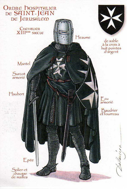 Specifically St John Ambulance WA site has lots of detail: http://www.stjohnambulance.com.au/
impact font with contrasting script front for sub headings. - focus on current services and initiatives - volunteering: range of roles: "These include administration duties, vehicle and building maintenance, public relations, fundraising, recruitment, social coordinators or committee members", can also included in depth training for being an ambulance officer, or a first aid volunteer at events. - Could focus on support roles - Could focus on event health Being an Event Health Services volunteer also creates many great opportunities for you to:
Dedicated and highly trained Community Care volunteers help a wide range of vulnerable people in many different, less visible ways, throughout Australia. Today there are over 2,400 Community Care volunteers around the country. Each state and territory provides programs in response to the needs of their local community. For more details of the programs in your state/territory ring 1300 360 455 or visit your local St John website. Could the training concept be combined with the knight motif? Support role filled by a medieval dressed individual? POTENTIAL CONCEPTS
Edit: replace one of the 'support roles' with a concept about the First Aid app. |
Melanie FulkerStudent designer, used to be a teacher, likes things to look nice Archives
May 2017
Categories |
 RSS Feed
