The focus for this activity was typography that communicated emotion.
I decided to narrow down the topic to a particular medium, namely books, because I have a bunch of them. Books generally give me emotional reactions, even if I haven't read them yet, because beautiful design communicates to much to me.
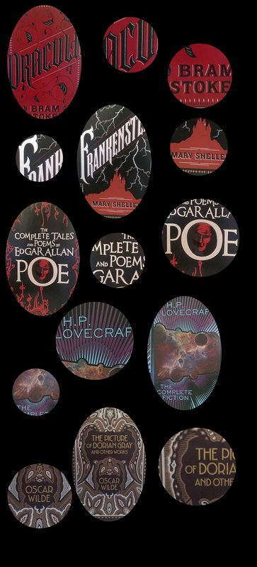
I narrowed my focus down further to look at Victorian and Modernist fiction/spec fic/fantasy/horror, because apparently I have a few.
The covers for 'Frankenstein' and 'Dracula' are similar, they are drawing on a combination of class, elegance, gothic tones, and metal type lettering. The Dracula font is sharper and leans more towards gothic, whilst the Frankenstein font has more body, a softer look, akin to Victorian carnival or 'nomadic' subcultures. The black and red are a fairly obvious choice, there are fewer colour pairings as strong as good old black and red.
The cover for the collected works of Poe is a simpler slab serif font, similar to early 1900s modernist typography, but with an affected kerning and letter size, to connect better with the themes of madness and lack of control commonly found in Poe's writing.
Speaking of madness, the extremely sharp sans serif font of the Lovecraft collection seems to be used in extreme juxtaposition to the content held within. The very busy, energetic cover needed something to keep the cover 'under control', and extreme and sharp angles are a common motif in Lovecraft's work, so the font on the front manages to make me still very uncomfortable. It's neatness and even kerning and uniform strokes feel like a false sense of security, 'too good to be true', that you still end up opening the book with a sense of dread.
There is a mix of different feelings with the Dorian Gray cover. The narrow lettering is reminiscent of the late Victorian, proto-art deco era in which Wilde wrote. The decadence held within is probably what pushed the designer to draw on art deco stylings despite the book being written significantly before that era. The decadence and engorged bowls and round counters of this typeface imitate the lavish lifestyle of the titular character, as well as hinting at the gluttony that is ultimately his downfall.
I decided to narrow down the topic to a particular medium, namely books, because I have a bunch of them. Books generally give me emotional reactions, even if I haven't read them yet, because beautiful design communicates to much to me.
I narrowed my focus down further to look at Victorian and Modernist fiction/spec fic/fantasy/horror, because apparently I have a few.
The covers for 'Frankenstein' and 'Dracula' are similar, they are drawing on a combination of class, elegance, gothic tones, and metal type lettering. The Dracula font is sharper and leans more towards gothic, whilst the Frankenstein font has more body, a softer look, akin to Victorian carnival or 'nomadic' subcultures. The black and red are a fairly obvious choice, there are fewer colour pairings as strong as good old black and red.
The cover for the collected works of Poe is a simpler slab serif font, similar to early 1900s modernist typography, but with an affected kerning and letter size, to connect better with the themes of madness and lack of control commonly found in Poe's writing.
Speaking of madness, the extremely sharp sans serif font of the Lovecraft collection seems to be used in extreme juxtaposition to the content held within. The very busy, energetic cover needed something to keep the cover 'under control', and extreme and sharp angles are a common motif in Lovecraft's work, so the font on the front manages to make me still very uncomfortable. It's neatness and even kerning and uniform strokes feel like a false sense of security, 'too good to be true', that you still end up opening the book with a sense of dread.
There is a mix of different feelings with the Dorian Gray cover. The narrow lettering is reminiscent of the late Victorian, proto-art deco era in which Wilde wrote. The decadence held within is probably what pushed the designer to draw on art deco stylings despite the book being written significantly before that era. The decadence and engorged bowls and round counters of this typeface imitate the lavish lifestyle of the titular character, as well as hinting at the gluttony that is ultimately his downfall.

 RSS Feed
