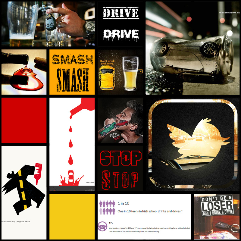
After reading through the linked article about design process and avoiding or carefully utilising cliché, I collected some images related to drinking, driving and teens doing these things on a Pinterest board.
The main motifs I observed were:
I sketched ideas to see what visually came about. My initial idea was to use a bottle or glass to obscure the road or important information to communicate the impact alcohol has on perception and safety.
The main motifs I observed were:
- Road
- Bold all caps typography
- ‘Stamped’ tagline
- Liquid/blood
- Red and black
- Bottle or glass
- Cars Insults
- Young males
I sketched ideas to see what visually came about. My initial idea was to use a bottle or glass to obscure the road or important information to communicate the impact alcohol has on perception and safety.
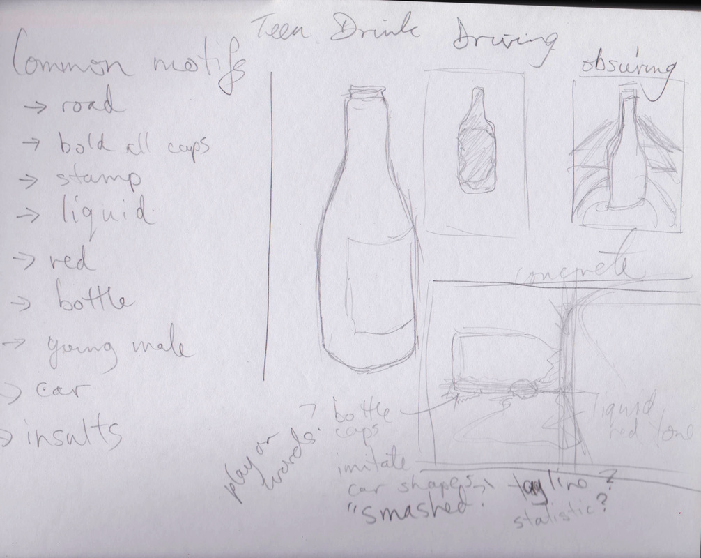
I apparently also forgot how to spell ‘obscuring’. I realised that I was lacking enough inspiration, as a lot of existing designs on close to this topic were related to either drink driving, teen drivers, but not often both. I re-read some of the articles from the online resources and realised I needed to further embrace research, especially as a statistic or quote could be an effective tagline.
Research lead me to a range of sources, which in turn revealed several discourses through which the topic of teen drink driving could be viewed: insurance, health, statistics. Different emphasis was found from source to source: youth health, use of drugs by young people, safety or ability of young drivers, alcohol itself, risky behaviour in general which included drink driving.
In general, the focus was on the impact of the driver, whether it be their reputation, costs, or their life. While some data referred to the damage it can have on others, it seemed that a more ‘self-centred’ approach made sense, which is in line with existing campaigns/designs that entreat the viewer to take care of themselves or insult them for drink driving.
http://www.cdc.gov/vitalsigns/teendrinkinganddriving/
The CDC don’t muck around, so their information seems useful. A visual link between drink driving and disease is perhaps too complicated and risks the message being obscured by contextual information (comparisons to other causes of death, numbers not seeming significant enough, not enough link to the ‘driving’ element of the problem).
http://www.progressiveonline.com.au/teen-driving.aspx
Despite not being a ‘health’ related site, the insurance site had useful and significant information. This same information was found on other sites, so they weren’t the only ones to use the same health source, but their choice of what information to use and the fact that they had it at all impressed me nonetheless. I came away with the idea that driving is dangerous enough for teenagers, let alone when you bring alcohol into the situation. References to existing ‘costs’ or ‘risks’ could work as a warm up to an ultimate ‘cost’ of death, which could work in a campaign, but not necessarily on a single design.
http://www.abs.gov.au/AUSSTATS/[email protected]/Lookup/4102.0Chapter5002008
As expected, the Australian Bureau of Statistics was flush with information, not all of it ‘exciting’, but definitely related to the specific issue of teenage drink driving. It also referred to vehicular collisions as the leading cause of death for young people, though it didn’t specify what portion was attributed to drink driving.
https://www.betterhealth.vic.gov.au/health/healthyliving/alcohol-teenagers
The Better Health site from the Victorian government used the sentence ‘Alcohol or ‘booze’ is widely used by young people’, but it was still useful in that it contained a link between deaths and BAC.
Ultimately, I decided my mood board needed to utilise colour, keywords and a small range of symbols or visuals.
 RSS Feed
